
Publicly Available Opioid Data
From a technical standpoint I took this project on to get some practice with APIs, refresh my SQL skills and scraping. There are also some great datasets for analyzing opioid use, a topic I find fascinating given the effects it has had on people’s lives.
Medicaid Data
Many states have created their own dashboards to track the opioid usage and give some historical persepctive. California is a great example, users are able to look at a wide arrary of variables such as opioid induced hospitalizations, prescriptions and deaths going back to 2008 bot at a state and county level. Another example is Arizona which has it’s dashboard for real time tracking of opioid prescriptions in the state. However, the limitation of both these dashboards is how far back the data goes. While the opioid crisis has come to prominence in recent years, opioid prescriptions have been on the rise since the late 1990s.
To overcome this lack of data for earlier years we can use Medicaid’s State Drug Utilization Data. The dataset has, for each quarter starting in 1991 Q1, the number of prescriptions and units dispensed through each state’s Medicaid program. The dataset contains all drugs dispensed through Medicaid and not just opioids. Another advantage of this data is that Medicaid has done a great job of cleaning the data and providing it both for download and through an API. The main drawback of this dataset is that it only covers Medicaid which accounts for roughly 20% of American’s health insurance. On the flip side to access to Medicaid typically limited to those with low incomes, a group that were disproportinately affected by the opioid crisis.
The only real cleaning step with this dataset is identifying which drugs are considered opioids. SDUD does not directly identify which drugs are opioids. Further, the CDC has created a publicly available dataset with the drug codes of what it considers to be opioids. By merging the information from the CDC dataset onto our SDUD dataset we can identify which entries in SDUD are in fact opioids.
if you were to dig into data and filter by drug name you may notice that there are certain entries with “Codeine” or “Hydrocodone” in the name but aren’t defined as opioids. Typically these prescriptions for cough and cold which contain codeine or hydrocodone and not typically in large enough quantities to lead to addiction.
Prescriptions over time
The app uses data from the SDUD API merged with the CDC dataset as outline above and allows you to see for each state the number of prescriptions, prescriptions per Medicaid beneficiary, units and Morphine Miligram Equivalent (MME) over time. The latter measure allows direct comparison of opioids by assessing their strength. Prescriptions per Medicaid beneficiary is only available from 2013 onwards since the data prior to that is spread out across each state’s Medicaid website. For ease of viewing I filtered to only show opioids that had over 10% market share in one state by prescriptions between 1991 and 2018. Even with this filter you can see that in many states the market is concentrated within two opioids.
Looking through at different states you may have noticed kinks in the data around 2005, 2010, 2014. The first kink in 2005 aligns with the creation of Medicare Part D. Prior to the creation of Medicare Part D some low income elderly would receive pharmacy benefits through Medicaid. After the creation of Medicare Part D, Medicaid became the “provider of last resort”.
What we see in 2010 is likely an early effect of the affordable care act, the act changed the way that Medicaid reported prescriptions to the government to ensure full reimbursement. Finally in 2014 many states expanded Medicaid. One conclusion that you may be tempted to draw from this is that expanding Medicaid made the opioid crisis worse. However, what matters to us is the opioids per beneficiary which as you can see implies a different conclusion.
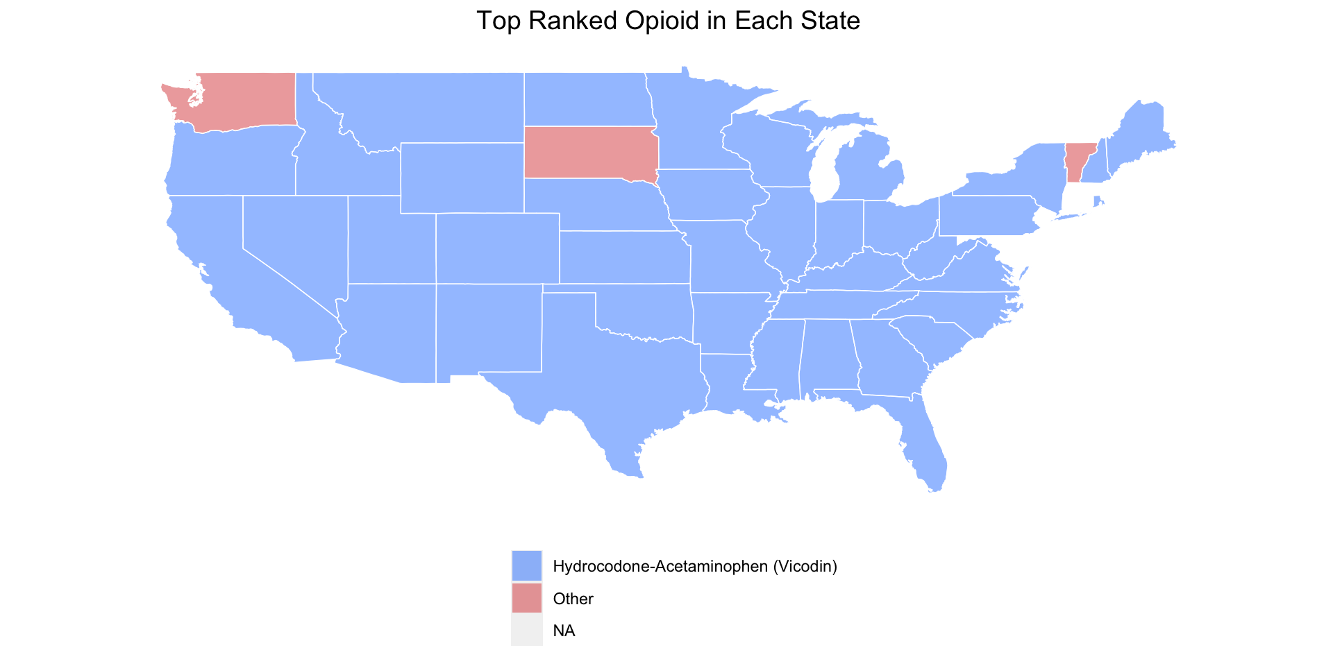
Within states you may have noticed that Hydrocodone-Acetaminophen and Oxycodone-Acetaminophen were the top prescribed opioids. One exception is New Hampshire which had a surprisingly even split over which opioids their Medicaid beneficiaries were prescribed. To illustrate this trend in Hydrocodone and Oxycodone-Acetaminophen is the map below that shows which states had each drug as their number top prescribed opioid between 1991 and 2018.
The most notable ommission from the graphs is Fentanyl. Fentanyl is an incredibly powerful opioid that can have strong side effects even when used in low doses. However, under Medicaid it’s rarely prescribed and is typically used recreationally rather than being prescribed.
Deaths from Opioids
The adverse effects of opioid cover drowsiness, confusion and in prolonged use severe constipation. In addition prolonged and intense use of opioids can result in death. To analyze the links between opioid usage and death we can use data directly from the CDC. For data on opioid related deaths we can leverage the Multiple Cause of Deaths database from CDC Wonder. CDC Wonder has some fantastic publicly available datasets and is fairly user friendly. The Multiple Cause of Deaths database allows you to request the how many people died from a certain cause by location and time period. For this exercise again I’m going to look only at deaths in states. We could go to a more granular level by county for example but at that point we hit data suppression i.e so few people died from a certain cause in a county in a year that you may be able to identify the individual.
As for prescription data we could leverage the SDUD used earlier. However, the deaths are measure across the entire states so the prescription data must be equivalent. In addition to their opioid classification dataset the CDC also publishes maps and tables detailing opioid prescribing in states over time. The app is built from data scraped from the CDC website. The first tab shows opioid prescriptions per 100 as well as deaths per 100,000 over time for a state of your choosing. The second tab shows the ratio of deaths to prescriptions, the darker the red the higher the ratio. The third tab plots the two variables on the same graph, and calculates the correlation between the two depending on which years you choose with the slider.
From the first and third tabs the evidence between opioid prescribing and deaths isn’t as strong as you may think in some scenarios the correlation becomes negative. However, this is likely masking the differences in opioid prescribing intensity. For example one prescription for 100 people and 100 prescriptions for one person with the other 99 are likely to have very different effects despite being the same prescriptions per 100 people.
The second tab goes someway to illustrating this issue. Restricting the years has very different effects. For example using the entire time period 2006-2018 the death to prescriptions ratio looks similar across states. However, restricting to 2006 to 2010 there are much darker red states. This was close to the peak of the opioid epidemic with prescribing intensity at an all time high. Whereas in 2014 the CDC brought in prescribing guidelines which dramatically cut the intensity of opioid prescriptions.
All the code needed to generate the content of this is in my github and I’ll continue to update as new quarters of data get released.